Unlock the business intelligence at your fingertips

Modern businesses have the ability to collect an overwhelming amount of data through their sales cycles. But unless you can make sense of the data you collect – and apply it in a meaningful way – you might not get the results you are hoping for.
An increasingly important tool for sales managers everywhere is the sales dashboard. A dashboard enables you to unlock the business intelligence at your fingertips, visualise trends and patterns, and tap into good data as a driver of business success.
Gartner defines the dashboard as: “…a reporting mechanism that aggregates and displays metrics and key performance indicators (KPIs), enabling them to be examined at a glance by all manner of users before further exploration via additional business analytics (BA) tools.”
The dashboard gives sales managers the key to understanding how their business is performing against KPIs, with the metrics to help make sensible business decisions. They are also a valuable tool for visualising patterns and trends, and spotting anomalies before more serious problems can develop.
Without a structured approach to using and organising your business data, your dashboard can easily get bogged down with colourful charts and statistics that provide information about interesting but sometimes meaningless insight.
In sales, the key to an effective dashboard starts with knowing exactly what you want to get out – and you can only find that out if the data is there to tell you.
So here are five things you might want to think about as you begin to create your perfect sales dashboard.
1. What do you want your dashboard to achieve?
What is your dashboard going to achieve – are you looking to monitor the performance of your sales team? It’s important to clearly define your vision and requirements before you rush headlong into building your dashboard.
2. Who is going to have access?
Dashboards may sometimes contain sensitive information which needs to be protected, so it’s important to think about who the dashboard is for and who is going to have access. This will have a bearing on the I.T policies you have in place.
3. How much will it be used?
Setting the data at the most relevant level is important. Thinking about how often the dashboard will be used will help to drive what you actually want to see. This will also ensure that you set any auto-refresh settings correctly.
4. Daily, weekly, or quarterly reports?
Is the data displayed for daily, weekly or even quarterly reporting periods? This will help you to filter the data at the right level and to remain consistent across your dashboard so that you’re comparing like for like when reviewing it.
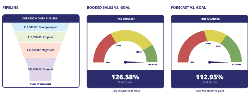
5. Pies, pipes, bar charts or funnels?
With so many different styles to choose from, you really need to think carefully about which charts are going to work most efficiently for you. Is a pie chart really the best way of comparing data or would a bar chart be a faster way of identifying the difference between metrics?
Features in modern CRM systems have become steadily more useful and interactive, with added features such as drill downs, filters, real-time updates and alerts, metrics and KPIs.
Dashboards are there to improve your sales potential, making sales coaching easier and helping your team to pinpoint issues and better focus their efforts.
The important thing to remember is that it’s all about the data – get that right and managing your sales teams will be much more straightforward.